We work with many small business owners who come to us for help with their websites. Some have very old websites, others have websites they built on their own, and some have professionally-designed websites that look pretty good. Regardless of the state of their current website, the most common reason these business owners come to us for help is that their website is not effective – it isn’t generating leads, visitors can’t find what they want, products aren’t being purchased, the site doesn’t show up in search engines. All HUGE problems.
So, what exactly makes a website effective? Here are five tips to help you make sure your website is helping you grow your business.
1. Make it Look Good
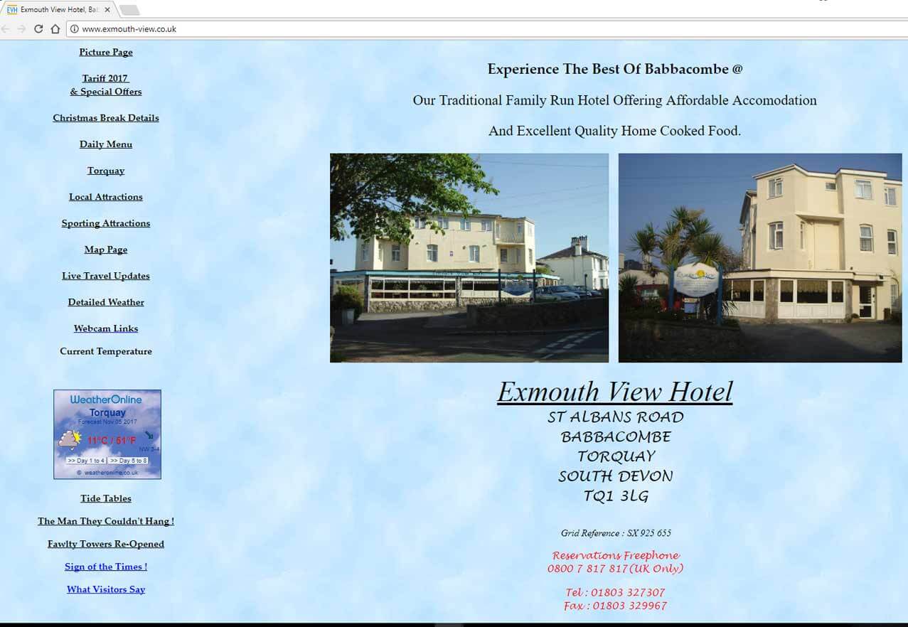
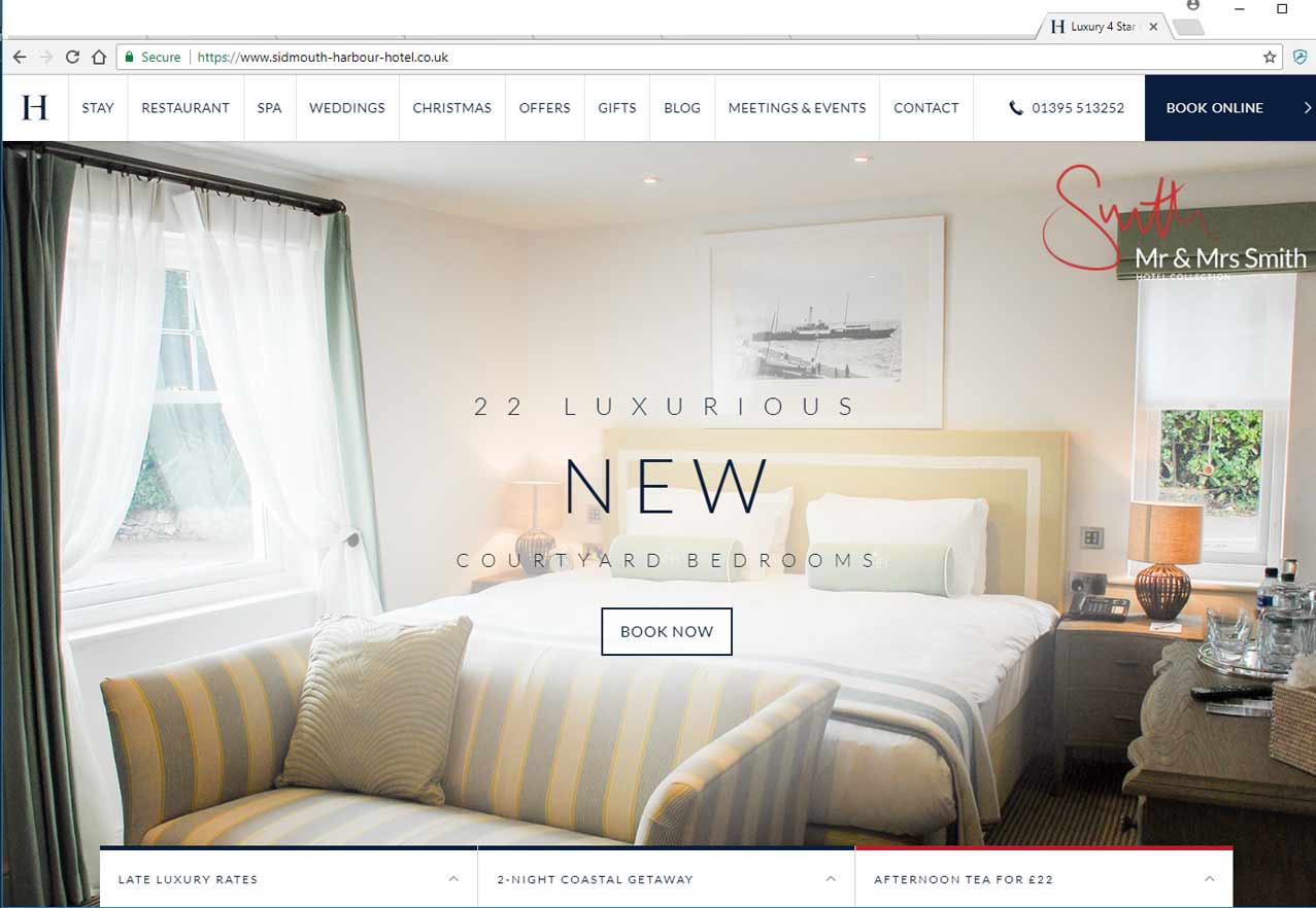
Your website needs to look good – it needs to look like it was built by a professional who knows what they’re doing. And here’s why: potential customers view your website to determine your credibility, expertise and authority. Consider this…if you were going to a job interview for a high-paying position, would you show up in business attire or would you show up looking like you just rolled out of bed? I’m betting you would choose the business attire because you know the value of making an unforgettable first impression. The same is true of your website! It will most likely be the first impression potential customers have of your company. If your site looks like it hasn’t been redesigned since 1998, or it looks like your third cousin’s uncle’s nephew built it as a class project, customers will question the legitimacy of your business and move on to your competition. You have to take advantage of the latest design trends, make good use of colors and images, and ensure that the look and feel of the website matches what you and your company are all about.Design matters…which hotel would you choose?
2. Keep it Simple
Life may not be simple, but your website should be. When people come to your home page, they don’t want to read through 12 paragraphs of your mission statement or try to decide which of 20 menu options they should click on to find what they want. Volumes of research has been conducted to determine how people use websites. One of the most important findings is that people scan websites. They come to your website for something specific and they want to find it fast! If they can’t find it quickly they will again move on to your competition. This means your website should be simple, clean, and organized with your visitors in mind first. Make it easy for them to find what they came for – your products or services! Here are a few ways to simplify your site:- Avoid large blocks of text on the home page. Use short paragraphs, call-outs, and bullets to make scanning easy.
- Simplify your site navigation. Have only one menu and try to limit it to no more than six options.
- Don’t be afraid of white space. If you have too many photos, animations, icons and text on your home page it can overwhelm and scare people away.
Look at the site below…where do you click first?
3. Make it Easy to Find
Even the best website is useless if it can’t be found. That’s why SEO – Search Engine Optimization – is so critical to having an effective website. Truly effective SEO can seem daunting to most business owners because it requires a detailed strategy, constant analysis, and time. However, a good way to start is by adding some basic SEO elements that every website should have:- Add a XML sitemap. This is a background file for search engines (not humans) that helps them easily understand the structure of your website. If you have a Wordpress site, the Yoast plugin is a great SEO tool and it automatically generates an XML sitemap.
- Optimize images. How quickly a website loads plays into Google’s rankings, and images with large file sizes can slow down your site. A good plugin for Wordpress sites is WP Smush, which can reduce file sizes without reducing image quality.
- Remove broken links. Sites and pages with broken links do not make for quality content or a good user experience, which is what search engines want to see.
- Add a Privacy Policy and Terms of Use/Service. Google considers how legitimate and trustworthy a website is when considering ranking, and having these pages plays into this.
- Add Meta Titles and Meta Descriptions. This information, added to the back-end of your web pages, is often what appears on search engine results pages. This is not a direct ranking factor, but there is an indirect benefit – more visits to your site can improve your Click Through Rate (CTR), which is a ranking factor.
4. Use a Call to Action
Just getting people to your home page is not enough. Without direction they won’t know what to do next. You can include a Call to Action button to indicate the next step a visitor should take, whether it’s to purchase a product, subscribe to an email, or download a guide. Here is a good example from a website we built for a client, The Rate Experts. The Rate Experts is a great company that will work with you to find a better rate on your car loan. Imagine that you search for “car loan rate” or something similar and decide to click on The Rate Experts from the list of search results. Within seconds of arriving at the home page you can very clearly see what to do next – Apply Now.
A good Call to Action will make it obvious what you want people to do, and it’s a good way to generate leads.
The Rate Experts is a great company that will work with you to find a better rate on your car loan. Imagine that you search for “car loan rate” or something similar and decide to click on The Rate Experts from the list of search results. Within seconds of arriving at the home page you can very clearly see what to do next – Apply Now.
A good Call to Action will make it obvious what you want people to do, and it’s a good way to generate leads.5. Provide Social Proof
Social Proof on a website is based around the psychology of following the crowd – the idea that if other people are doing it, it must be good! Show visitors that you’re not just some random company out there, you are a valuable provider of products or services used by many others. Some good social proofing techniques include:- Testimonials – Testimonials put a human face on the quality of your business. Make sure to use real customers and photos.
- Number of Social Shares – Show how many people are sharing your content on social media. Services like SumoMe or plugins like Social Warfare are an easy way to add this to your site. These services also add buttons to your website that make it easier for people to share your content on social media.
- Logos – Display logos of companies that have hired you or places you’ve been mentioned, such as other blogs or websites, radio or TV.
If you have any questions at all, please feel free to ask in the comments below and we are happy to help! We’d love to connect with you on Facebook, Twitter, Instagram and LinkedIn so we can follow along with what you’re doing too! And finally, if you are a small business owner struggling to do what you do best AND to figure out how to stay on top of the latest changes, strategies, tips and tools in online marketing, we’d like to personally invite you to join our private Facebook Group, Bobbi B’s Social Media Clambake, where we share all that information for free!


Brian Rugg
Vice President, Think Big Go Local, Inc.
My focus is on web site design and usability, search engine optimization, and content strategy. More than just building a flashy website, I strive to make sure my work accurately reflects our clients’ brand and message to help drive sales.
